
It was Thursday evening
Entertainment venue: Shenkar, Faculty of Design
What’s going on: presentation in the Department of Jewelry Design
Which course: designing display windows
The course has been running at Shenkar for 14 years, headed by Gillian Golan and Hagar ben Shalom
Moderators for the current course: Gillian Golan who specializes in business development in the field of design and Yoav Miller, a sculptor who has brought a new and fresh perspective to the design department.
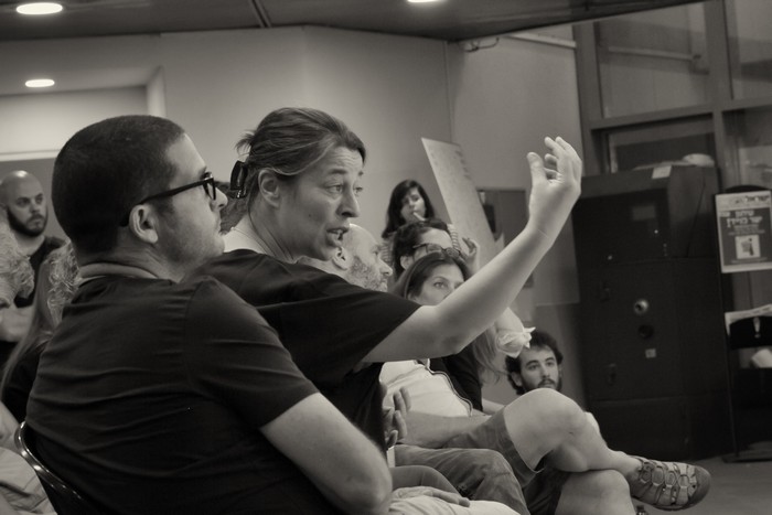
Why I’m there: I was invited, as a guest critic to give an appraisal on the students’ work
Me. A critic? More on this at the end of the post. Stay tuned 🙂

The course on display windows is a unique course within the framewrk of the Department of Jewelry at Shenkar. After 4 years during which the students design in the scale of millimeters, they are asked to design a display window two meters high. They probably feel like Lilliputian in the land of the Giants. Apparently this is also the first time that they experience their jewelry from the commercial aspect of a display window. The aim: to transform a good concept into a harmonious window that will create this “must have” feeling and make passersby stop, desire and forget all about their plans for that day!

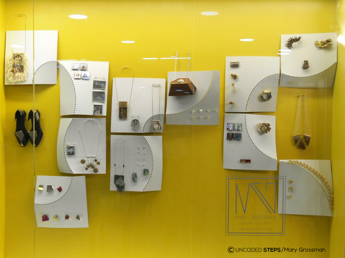
Every two months five different students present the display window they have designed. This is a year’s course so the teaching staff make sure that the students will give their blood, sweat and tears throughout the year; designing is first of all a process and research, and only then are the design decisions expressed in material and the small details.
So who do we have this time?
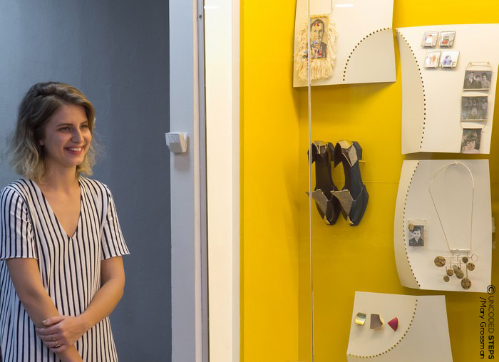
Mary Grossman
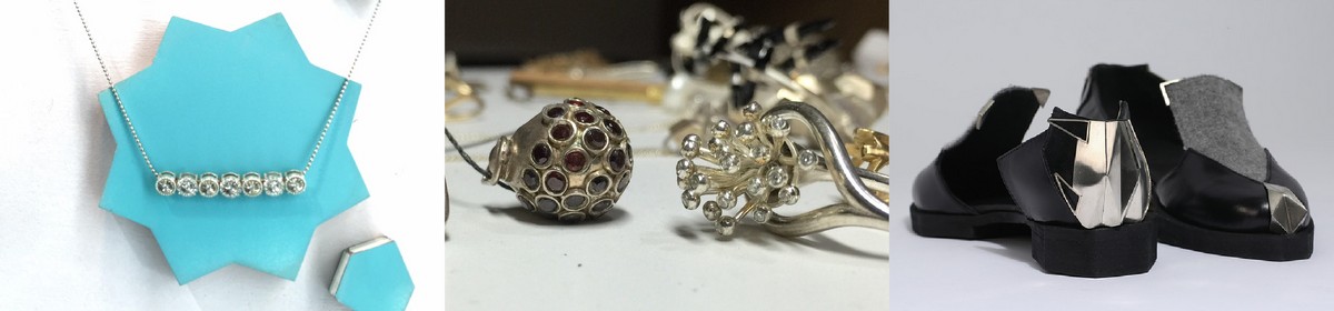
Mary’s window is painted yellow with touches of ochre which break it far from the CMYK yellow but still leave it close to the circle of bold colours. Mary chose a central element in her jewelry design – a fold line that creates a three-dimensional structure with a clean look – and used it on a large scale in order to create aluminium display surfaces. Each surface is a unique design yet still a clear and uniform language. The aluminium surfaces define a display area within the large window, leaving a yellow surround, which is exactly what our eyes and soul crave for.
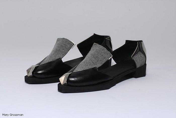
Mary has also designed shoes inspired by the architect Dominique Perrault and they continue Mary’s design language: folds, fragmenting, and building anew through a variety of materials – leather, silver and plastic. The final result of the shoes is a combination of serious avant garde with a dash of darkness; just the way we love it 😉
You can see more of Mary’s work here
Shoes inspired by architect Dominique Perrault. I love its folds and the geometric sensation.
Mary Grossman’s chess board. Folds, bold colours and a clean look; style with a clear hand writing

Chain of hearts, response to one of the narratives that occupies the jewelry world – a heart is the most widely sold shape in jewelry.

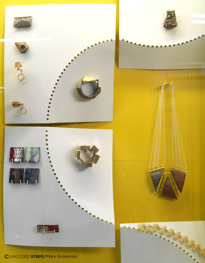
Two windows, two colours which tell so many stories.


Liraz Borstain
Liraz presented an aesthetic and precise window at a high standard. The items are presented on panels that echo and resonate the jewelry. How did she do this?
Elastic bands were her starting point. The same elastic bands used for wax injection. She incorporated them to create surfaces into which she poured silicone. Does this go without saying? No, absolutely no! This is a technique developed by Liraz herself.
The general sensation is of floating archeology, as if an historical secrete is revealed to us, sharing with us its ancient pink spell. Liraz’s jewelry are created from a variety of materials and textiles, in integrated technologies

In the picture three pieces of Liraz’s jewelry:
The piece on the right is made from biased cut ribbons and beads,
The middle piece is made from biased cut ribbons and metal,
The smaller pendants on the left are made from synthetic threads using heating technique


Maya Shoshan
Combined inspiration from Britain and Africa which were an endless source of inspiration for her during her studies, but this time she decided to also make a stopover in Casablanca, which danced in the background in a blue print image and three-dimensional elements which served as connectors and hooks on which she presented the jewelry. Maya is a creator who follows the charm of beauty, and she blends eclectic elements in a way that sparks inspiration. We didn’t fully understand the flight path she chose: Britain-Casablanca-the depths of Africa, but hey, who said design is all about logic? In Maya’s hands this turns this into an aesthetic logic.
As a designer who usually falls in love mainly with the idea, I wondered about this. Yael Ulliel described this beautifully when she suggested refining the terms so as to create a more exact and integrated design.Yet Maya’s love of the magic of beauty transcends above all this, or as Uri Samt summarized: your noise is not noisy, harmonious noisy.
See more on Maya’s instagram page
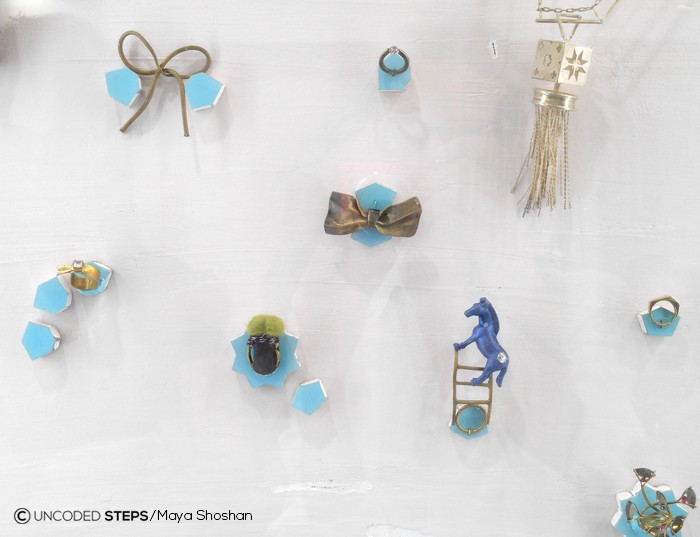
English horse, African bag and Moroccan decoration. A new logic in a rich and global world.


Tal Efraim
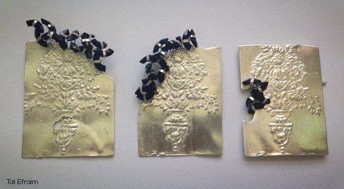
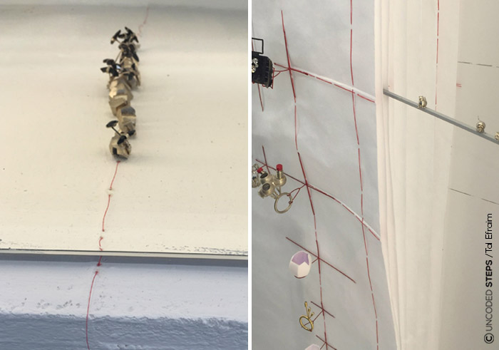
Placed in the window large pages which resemble a gigantic sketch book. (Haven’t we’ve said Lilliput already?? 🙂 Tal has created order in the space, first by the sketch book, which is smaller than the window. An excellent decision; you don’t have to use all the window, sometimes the ’emptiness’ defines the center and the essential. To the sketch book Tal added an element from the world of sewing – a large red stitch which creates a grid along the page from which the connectors sprout, the hooks which serve to display the jewelry. The transition between the red stitch and the red metal hooks is almost invisible – it’s not obvious to create such an harmonious transition between two different materials, so that they will look almost as one.
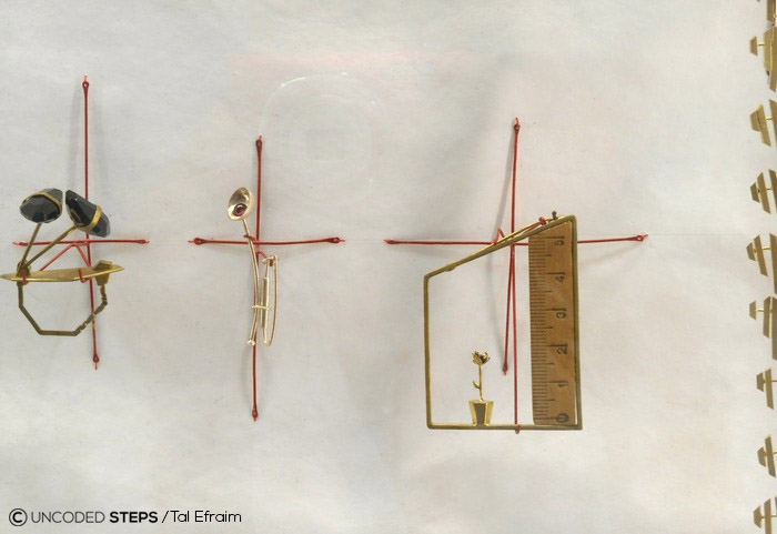
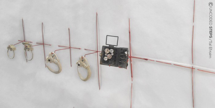
Jewelry designed by Tal Efraim. On the right, silver ring, a model that was built and printed in 3D, and zircons. In the centre a pendant set with garnets and on the left a brooch from 925 silver and pure silver inside.
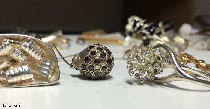
Brooches made of silver plated brass. Tal already created a relief by hand during the wax stage, before the metal was poured. The black stones – Swarovski stones in a limited edition
What else would we just loooove to see: adding pages so we get more of this ‘sketch book’ feeling, and connecting the sketch book to the background using the red stitch instead of the aluminium pole. In my opinion a less shiny background would also add. Extra brilliant: the little irregularities of the threads which pop out of the sides and bottom of the sketch book; escaping the order. To me this felt like a dash of good British humour – a (very) little wink taking place in the margins 😉
Interesting items from Tal Efraim’s display window: elements that “escape” from the sketch book. One of them is even sewn into the wall
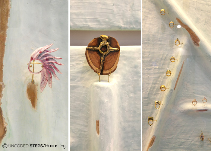
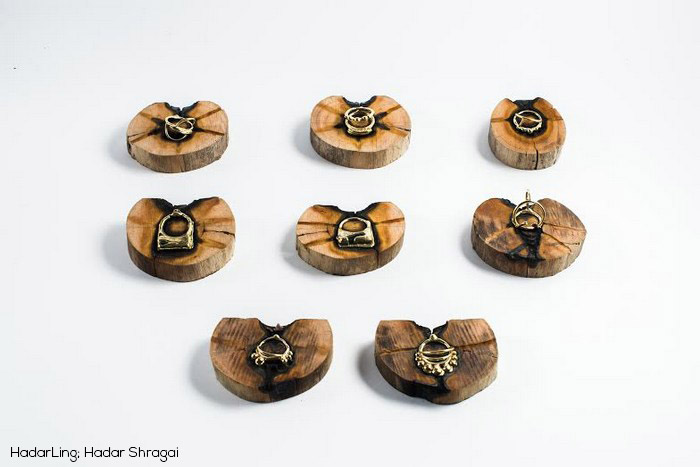
Hadar Shragai
Displayed her jewelry on a background that combines recycled wood coated in concrete with the stucco technique, a technique characterised by coating, planing and so forth, like a soft sculpture on the concrete and wood. The result exposes the wood from between the concrete which is painted in blue and similar to the woodwork found in some of her jewelry designs. A (slightly) more detailed explanation about stucco at the end of the post.
The division of the background into four panels refreshes and contributes to the composition, and the light colour lends softness and leaves centre stage to the jewelry.


What people were wearing and a little more atmosphere
Mary is wearing Adidas sneakers in a colour reminiscent of Liraz’s window. Did they plot this together? 😉

Several levels above the regular snacks; stylish catering! Missing in this picture: the fine wine and sweet watermelons which were part of the fun.

The presentation has ended, and where am I in the big, or small picture?
After the presentation I met up with friends.
“I was at a presentation at Shenkar”, I told them, “Is was invited to be a critic, and I am not crazy about the word critic. When I was studying design the criticism wasn’t ‘my cup of tea’. I think everyone suffers from this at one level or other. I am looking for an alternative word. I thought of feedback. But that’s also not so great”
“Mentor, you’re a mentor!”, Niva said
“No”, I said, “mentor is for someone who’s studied, who has education and training”.
Perhaps we could call it a design dialogue, or a creative conversation? I don’t know, let’s leave it for the moment as an open and wild question. One day I’ll understand who I am and what my role is in Lilliput, the land of Giants and the Little People.
Further reading;
In Hebrew about the creative process and design process. If you find your way in this biblical language the following posts are really cool and interesting
From Mina Protnov-Mashan’s “Migdala” blog, a series of three posts about design thinking. For the first post, second and third.
From Carina Weber’s blog, The Trilogy of Creation; part one, two and three.
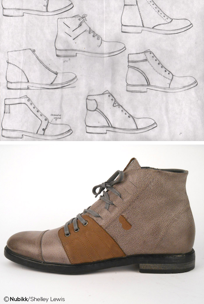
Shoe I designed for Nubikk
The sketches are a (small) part of the entire design process
Additional lecturers
Who took part in the presentation and contributed their experience, knowledge and insights to the lively discussion about display windows
Sharon Keren, current head of the department
Uri Samt, incoming head of the department
Batya Wang
Yael Ulliel
Uriel Miron
And of course the moderators Gillian Golan and Yoav Miller
More about Stucco
The attached description is based on an explanation I received from Hadar – another minute and I’ll start plastering by myself 🙂 The word stucco describes a certain type of plaster which is used as a surface finish.
The first layer on the blue panels of Hadar’s display window are made from compressed OCB wood. Hadar used the wood as a means of creating the main composition of the panels, the three-dimensional structure
Above this is a netting combined with a semantic splattering ( I learnt many new terms about plaster!) – crude plaster that can be used for building and sculpturing and on top of that, the queen of the layers – the stucco! Two very thin layers of plaster. Before the plaster dries it’s polished with cotton material, a process which creates a shine and gives the whole window its unique appearance
And to summarize the process: at the end of the day caressing and gentle strokes is what we really love and need . Remember this when you are on the way from the Land of the Little People to the Land of the Giants 🙂
